How you can use shorthand
Combine large, bold images with the beautifully crafted words for your feature.


Text
By default a Text Section includes a single column of text, which can be placed to the left, centre or right of wide screens. The column will be central on small screens such as portrait-mode phones.
Text is rendered on the page in blocks. Style options include:
Paragraph text (the default text styling)
One of three heading styles (small, medium, large)
A Quote
Text with a styled drop-cap (large initial letter)
- A bullet-point list
- A numbered list
An indented paragraph
A breakout box
Text Over Media
Use Text Over Media to add a section of large-sized text. This section type is often used to create chapter headings, as well as deliver pull quotes, highlight key data, and even to include full-screen images or looping video without text.
Media Guidelines
Image Requirements:
Full-screen landscape image: 2560px x 1440px JPEG
Full-screen portrait image: 1080px x 1920px JPEG
Video Requirements:
1920px X 1080px (2mb per 5 seconds file size reccommended)

Background Scrollmation
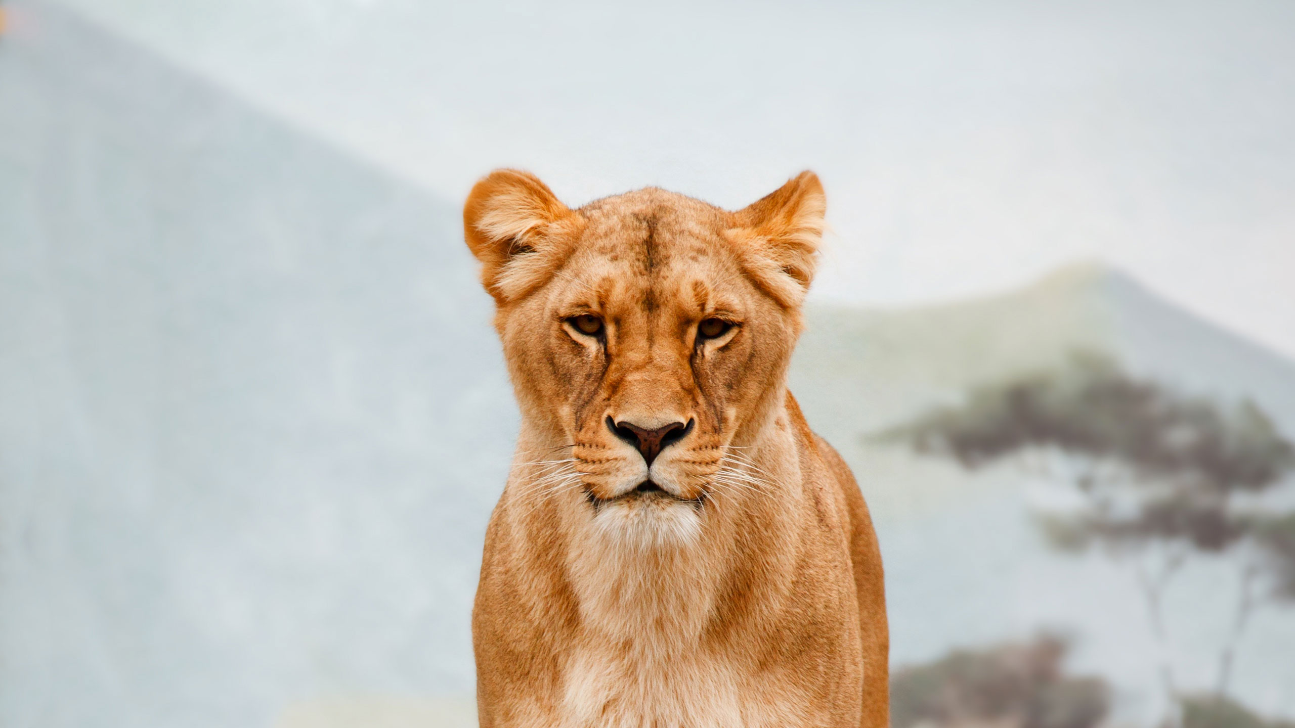
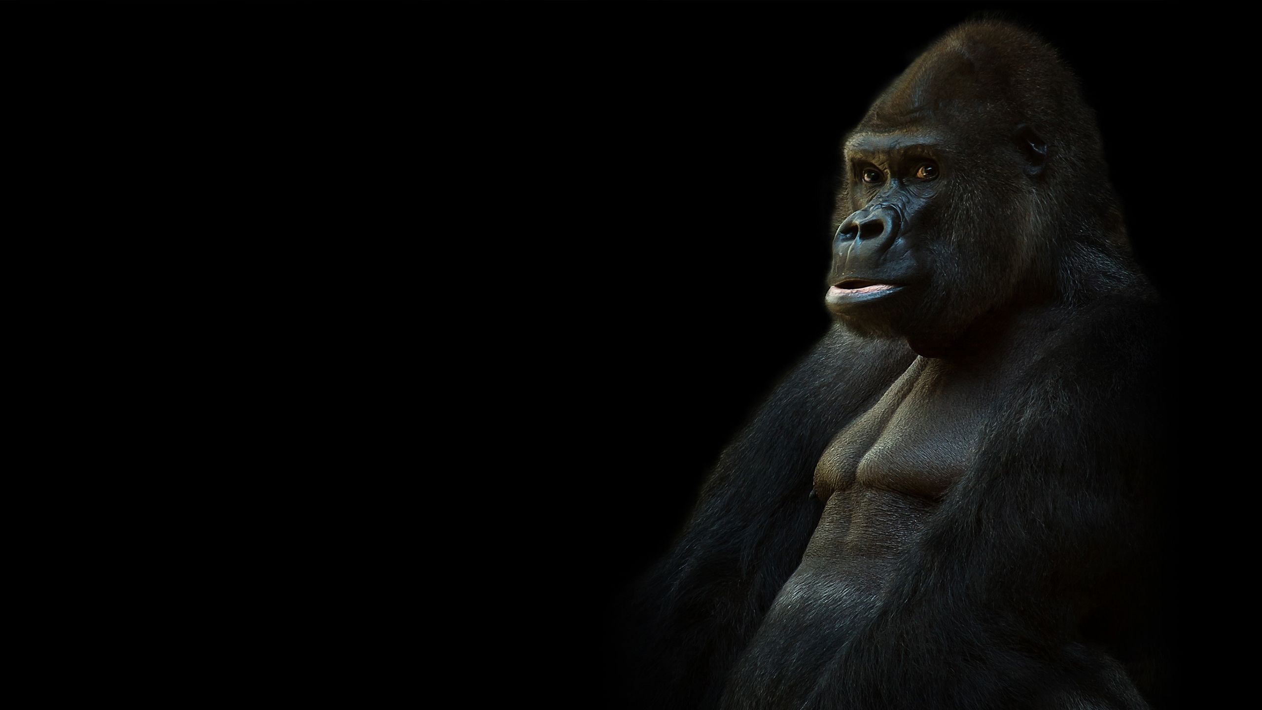
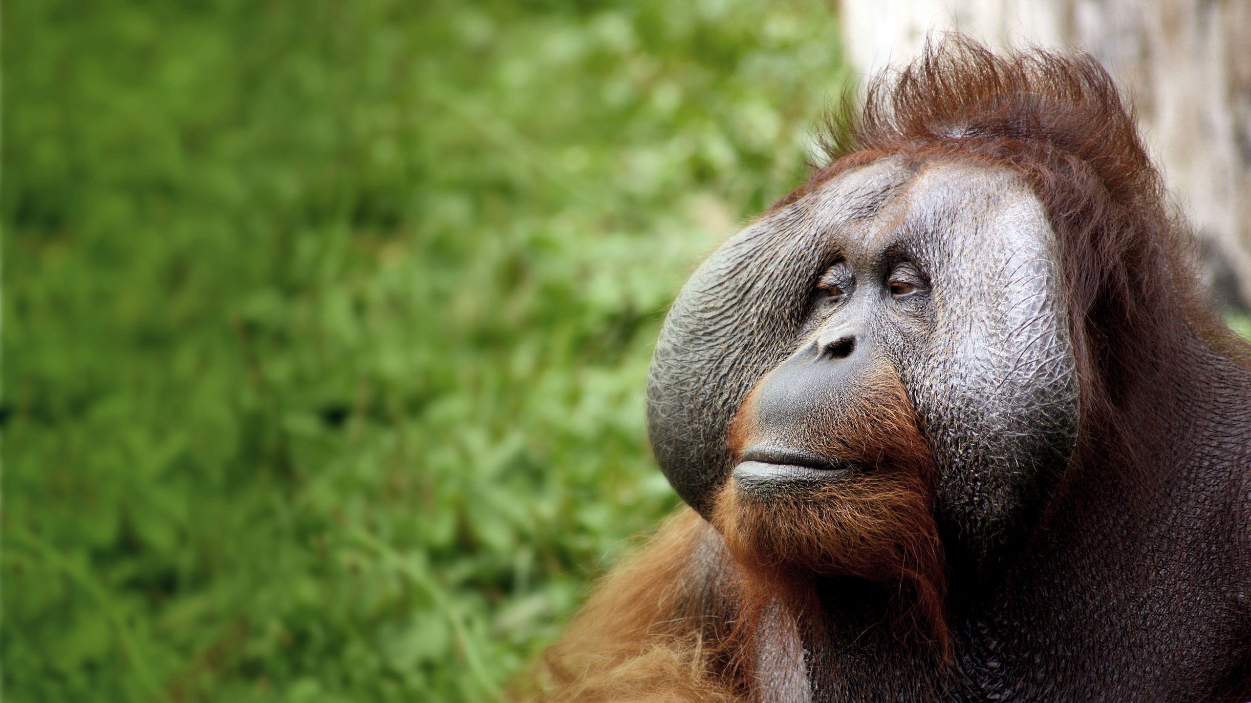
The Background Scrollmation section features a text column and one or more full-screen background images which change as the reader scrolls.
Media Guidelines:
Full-screen landscape image: 2560px wide x 1440px JPEG
Full-screen portrait image: 1080px wide x 1920px JPEG
Lorem ipsum dolor sit amet, consectetur adipiscing elit. Vivamus eu felis nec quam iaculis lobortis facilisis et leo. Phasellus ultricies purus et fermentum pharetra. Nunc vel elit nec nulla ultrices pellentesque quis aliquam orci. Etiam efficitur ligula id nisl pretium, ac faucibus purus finibus. Cras at vehicula nulla, a viverra augue. Mauris laoreet sodales elit, eu tempor ligula porttitor in. Curabitur ornare sapien eget leo dignissim, id suscipit erat ornare. Nullam nec aliquet turpis, nec vehicula nulla. Fusce iaculis tellus et laoreet porta. Sed et tristique nunc. Integer eu eros interdum, blandit felis id, tempus tortor.
Aenean sit amet sapien augue. Praesent elementum neque nec viverra consectetur. Vivamus tincidunt dignissim felis, sed tincidunt ipsum faucibus laoreet. Nunc suscipit erat nulla, id ornare neque accumsan ac. In aliquam ut risus et auctor. Fusce consequat lacinia lacus at facilisis. Vestibulum nunc nunc, tincidunt ac dolor in, elementum malesuada lectus. Maecenas vel libero ipsum. Ut vel massa quam. In et accumsan ipsum. Morbi fermentum scelerisque justo eu viverra. Proin in gravida urna, vel rutrum lectus. Quisque non mi dignissim, ultricies velit sit amet, rhoncus dui. Nunc vitae magna consequat, malesuada est non, fringilla ex.
Ut convallis ex id ligula rutrum, et aliquam arcu condimentum. Quisque pulvinar mi id dui facilisis pulvinar. Cras volutpat eros at suscipit hendrerit. Phasellus laoreet nisi quis justo bibendum, id pellentesque lorem interdum. Sed lorem arcu, ultrices et sem non, tincidunt condimentum turpis. Sed efficitur orci placerat nisl tincidunt posuere. Donec ullamcorper ullamcorper risus quis hendrerit. Morbi gravida ex vel ipsum hendrerit semper.
Morbi tempor, velit vitae volutpat sodales, nisl dolor maximus tortor, sed blandit diam dui at leo. Donec eleifend sollicitudin ante non hendrerit. Vivamus pretium nec ligula non faucibus. Donec sit amet quam eget magna auctor ultricies. Sed vehicula vulputate porttitor. Maecenas ut ante odio. Quisque euismod orci eu nisl cursus vestibulum. Maecenas eu fringilla orci, et varius purus. Etiam auctor arcu sapien, eget facilisis lacus placerat ut. Duis non lorem vel ipsum egestas hendrerit ut id quam. In at ornare urna, eget scelerisque orci. Proin vehicula euismod mi, at sagittis erat malesuada sed. Praesent imperdiet fringilla lacinia. Integer dignissim tellus vel nisi finibus, ac luctus quam imperdiet. Curabitur congue, orci hendrerit eleifend suscipit, arcu nisl luctus risus, tempor efficitur lectus urna id nibh. Nulla iaculis rhoncus sem quis convallis.




Scrollmation
The Scrollmation section (or 'Two Column' or 'Two Row' Scrollmation section) features a text column and images that change in sequence as the reader scrolls.

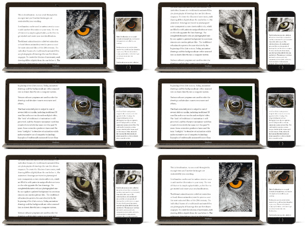
By default, on wide screens, the text and images appear side-by-side in columns and on narrow screens (such as phones) the images and text appear in the same column with the images at the top and above the text, so that the text scrolls under the images.
As the reader scrolls, if there is more than one image they will change in sequence. The rate at which they change will depend on how much text has been entered and how many images have been added.
Media Guidelines:
Big Image (for large screens) 800px wide x 1422px high
Small image (for small/narrow screens) 1422px wide x 800px high.
Lorem ipsum dolor sit amet, consectetur adipiscing elit. Vivamus eu felis nec quam iaculis lobortis facilisis et leo. Phasellus ultricies purus et fermentum pharetra. Nunc vel elit nec nulla ultrices pellentesque quis aliquam orci. Etiam efficitur ligula id nisl pretium, ac faucibus purus finibus. Cras at vehicula nulla, a viverra augue. Mauris laoreet sodales elit, eu tempor ligula porttitor in. Curabitur ornare sapien eget leo dignissim, id suscipit erat ornare. Nullam nec aliquet turpis, nec vehicula nulla. Fusce iaculis tellus et laoreet porta. Sed et tristique nunc. Integer eu eros interdum, blandit felis id, tempus tortor.
Aenean sit amet sapien augue. Praesent elementum neque nec viverra consectetur. Vivamus tincidunt dignissim felis, sed tincidunt ipsum faucibus laoreet. Nunc suscipit erat nulla, id ornare neque accumsan ac. In aliquam ut risus et auctor. Fusce consequat lacinia lacus at facilisis. Vestibulum nunc nunc, tincidunt ac dolor in, elementum malesuada lectus. Maecenas vel libero ipsum. Ut vel massa quam. In et accumsan ipsum. Morbi fermentum scelerisque justo eu viverra. Proin in gravida urna, vel rutrum lectus. Quisque non mi dignissim, ultricies velit sit amet, rhoncus dui. Nunc vitae magna consequat, malesuada est non, fringilla ex.
Ut convallis ex id ligula rutrum, et aliquam arcu condimentum. Quisque pulvinar mi id dui facilisis pulvinar. Cras volutpat eros at suscipit hendrerit. Phasellus laoreet nisi quis justo bibendum, id pellentesque lorem interdum. Sed lorem arcu, ultrices et sem non, tincidunt condimentum turpis. Sed efficitur orci placerat nisl tincidunt posuere. Donec ullamcorper ullamcorper risus quis hendrerit. Morbi gravida ex vel ipsum hendrerit semper.








Reveal
Reveal sections feature full-screen images and a number of different transition effects between them that are applied when the reader scrolls through the story. It is also possible to add a block of text for each image. Transitions between images include swipes up, down, left and right, and also a fade effect.
Media guidelines
Full-screen landscape image: 2560px x 1440px JPEG
Full-screen portrait image: 1080px x 1920px JPEG
Optional extra text section 1
Optional extra text section 2
Media Gallery
The Media Gallery section is the easiest way to place a grid of images and/or videos within your page. Images displayed within the grid can be clicked by your readers to expand them to display full-screen, at which point they can click or swipe through each of the images in the set.
There are no image restrictions with this section.







Media
Video
Unlike background video in other sections, video added to the Media section sits in a player, and features play, pause and sound controls.Video can be added to a media section as an MP4 file you upload, or a link to a file on YouTube.
Images
Unlike images added to Title, Text Over Media, Background Scrollmation or Reveal sections, images added here will not get cropped to fill the screen. Instead they will sit to their original aspect ratio, and simply reduce in size if necessary.
This enables you to show, for instance, tall portrait images that can be seen in full on a desktop landscape screen, or short images that will only use a small portion of the screen.
Media guidelines:
Image:
Up to 2560px wide JPEG
Video:
1920 x 1080px MP4 for landscape format video and 900 x 507px for portrait format video is sufficient for a clear picture. Smaller sizes of the same aspect ratio will work, but may appear less clear
100mb MAX (much smaller if possible) – see video encoding guidelines and other resources for suggested video compression tools
Poster image (same dimensions).
YouTube:
YouTube video page URL. E.g., https://www.youtube.com/watch?v=eimN_rrqnsQ



 Built with Shorthand